
Education · By Ayushi Shah · 6 August 2026 · 8 min read
Surface Pattern Design 101: Seamless Repeats Explained
How seamless patterns actually work — repeat types, 300 DPI, file formats, scale, colour and the five mistakes that cost brands money.
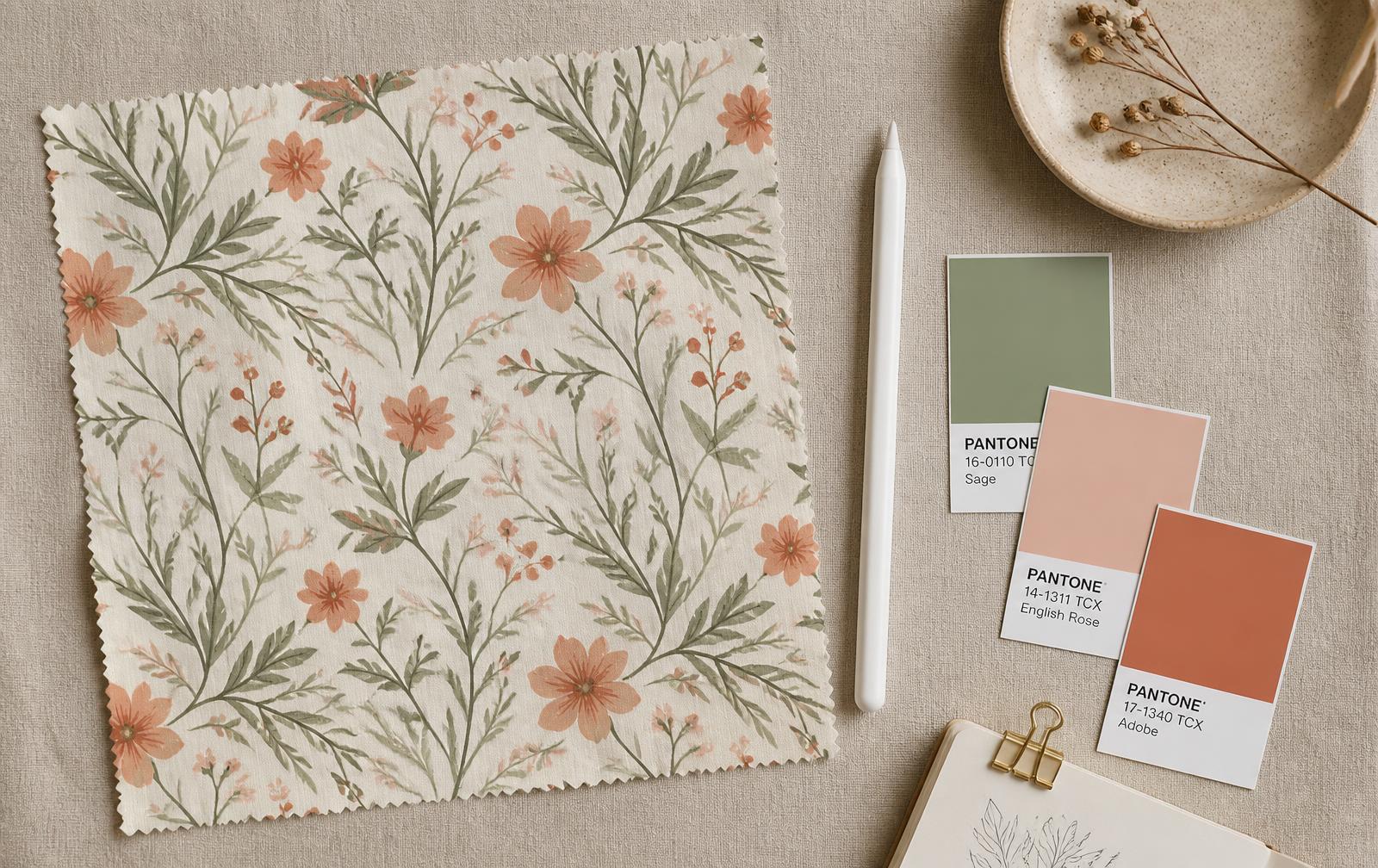
In short
Key takeaways
- A seamless pattern is one tile drawn so every edge continues into the next — no visible seams when it repeats.
- Drop repeat suits organic and floral artwork, mirror repeat suits symmetrical geometrics, half-drop suits dense, complex patterns.
- 300 DPI is the professional print standard; 72 DPI is screen-only and prints blurry on fabric.
- Prepare print files in CMYK and keep RGB for screens and e-commerce imagery.
- PSD is for editing, TIFF is what mills print from, PNG is for web and mockups.
- Scale changes everything: small ditsies read as texture, large blooms read as statement — always test a swatch at true size.
- The five costly mistakes: poor registration, wrong DPI, untested scale, weak colour separation, and skipping a printed test repeat.
- Standard licences suit volume and budget; exclusive licences retire the design from sale for a signature print.
Surface pattern design is the craft of creating artwork that lives on a surface — fabric, wallpaper, packaging, ceramics, stationery — rather than inside a frame. It sits between illustration and manufacturing: the drawing has to be beautiful, but it also has to tile, print and behave predictably on a production line.
For fashion labels, textile mills and home décor brands, a well-built seamless pattern is infrastructure. It is the difference between a print that runs cleanly across a hundred metres of fabric and one that reveals a hard line every 30 centimetres. Buying or commissioning a pattern that has been drawn as a proper repeat, at the right resolution, in the right file formats, removes an entire category of production risk before the first sample is cut.
This article covers what a seamless pattern actually is, the three repeat types you will meet most often, why 300 DPI matters, which file formats to ask for, how scale and colour change the way a print reads on a product, the five mistakes that cost brands money, and how to apply patterns across fashion, home, stationery and print-on-demand. This guide breaks down everything you need to know.
What is a Seamless Pattern?
A seamless pattern is a design that repeats continuously without visible seams or interruptions. One unit of artwork — the tile — is drawn so that every element crossing the right edge re-enters on the left at exactly the same height, and every element leaving the top re-enters at the bottom. Place those tiles side by side and the joins disappear.
Imagine wrapping a single unit around a cylinder infinitely. Where the paper meets itself, nothing jumps: the stems continue, the petals complete, the texture keeps its rhythm. That is the whole test of a seamless repeat, and it is why the work happens at the edges of the tile as much as in the middle.
In production, the tile is stepped across the width of the fabric and down its length. A rotary or digital printer repeats the same file thousands of times, so any flaw is repeated thousands of times with it. The same file can then be scaled and reused on a cushion, a gift wrap sheet or a phone case without redrawing anything.
Brands choose seamless patterns because they are efficient and consistent: one file covers an entire collection, sampling is faster, colour and scale can be adjusted centrally, and the print reads as a deliberate brand signature rather than a placed graphic.
Understanding Repeat Types
Every seamless design uses a repeat structure — the geometry that decides how one tile relates to the next. The structure you choose changes how the eye travels across the cloth, how visible the grid becomes, and how forgiving the pattern is on a garment.
Drop Repeat
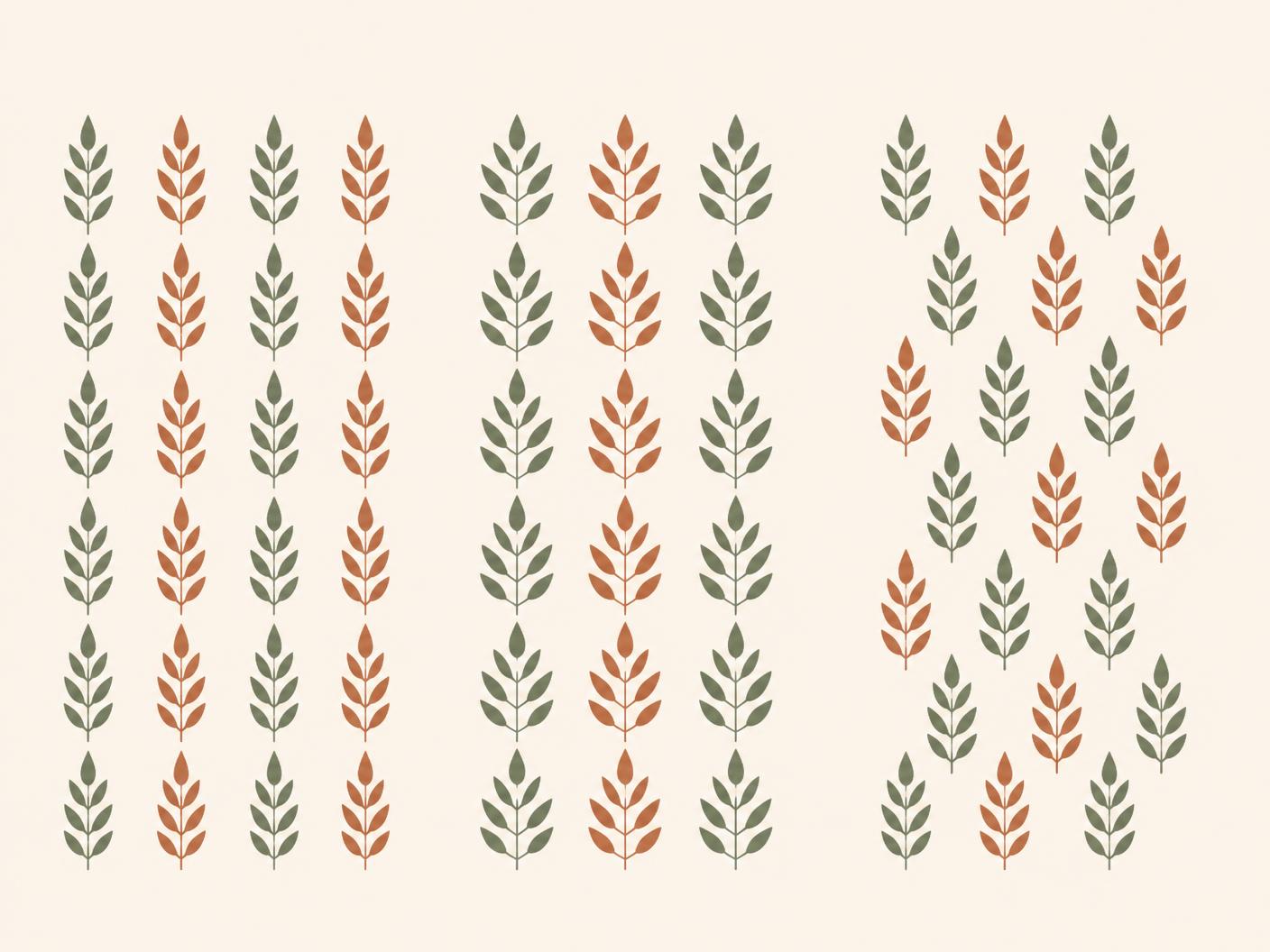
In a drop repeat, each row is offset — dropped — relative to the one before it, so motifs never stack into a rigid column. The offset softens the grid and makes the design feel grown rather than constructed.
- Best for: directional designs, florals, organic and hand-drawn patterns.
- Hides the tile edge well, because the eye follows the diagonal drift instead of the seam.
- Most floral patterns use drop repeat for natural flow.
Mirror Repeat
A mirror repeat reflects the artwork symmetrically along a vertical or horizontal axis, so each tile is the flipped twin of its neighbour. The result is balanced, formal and highly stable — useful when you want the print to sit still rather than move.
- Best for: geometric, symmetrical and ornamental designs.
- Creates strong secondary shapes where the two halves meet — check those junctions carefully.
- Geometric patterns often use mirror repeat.
Half-Drop Repeat
The half-drop repeat offsets each adjacent column by exactly half the tile height (a brick repeat does the same thing horizontally, by half the width). It is the most technical of the three: the maths has to be exact, or the drift becomes visible as a staircase across the fabric.
- Best for: complex, dense or dynamic patterns where a straight grid would look mechanical.
- Distributes motifs most evenly, so gaps and clusters are least noticeable.
- Requires precise alignment — test the tile at real scale before signing off.
As a rule: use a drop repeat for organic and botanical work, a mirror repeat when symmetry is the point, and a half-drop when the artwork is busy enough that any visible grid would flatten it.
The Role of DPI in Pattern Design
DPI stands for dots per inch — the number of ink dots a printer lays down across one inch of material. It is the practical measure of how much real detail a file carries when it is physically printed.
300 DPI is the professional print standard. At that density, fine stems, watercolour edges and small ditsy motifs stay sharp on cotton, silk, linen and paper. 72 DPI is a screen resolution: it looks fine on a monitor and falls apart on fabric, because the printer has roughly a quarter of the information it needs per inch.
Colour space matters just as much. CMYK — cyan, magenta, yellow, black — is the subtractive model printers actually use, so print-bound files should be prepared and proofed in CMYK. RGB is additive and made for screens; it can display vivid colours that no ink can reproduce, which is why an unconverted RGB file often comes back from the mill duller than expected.
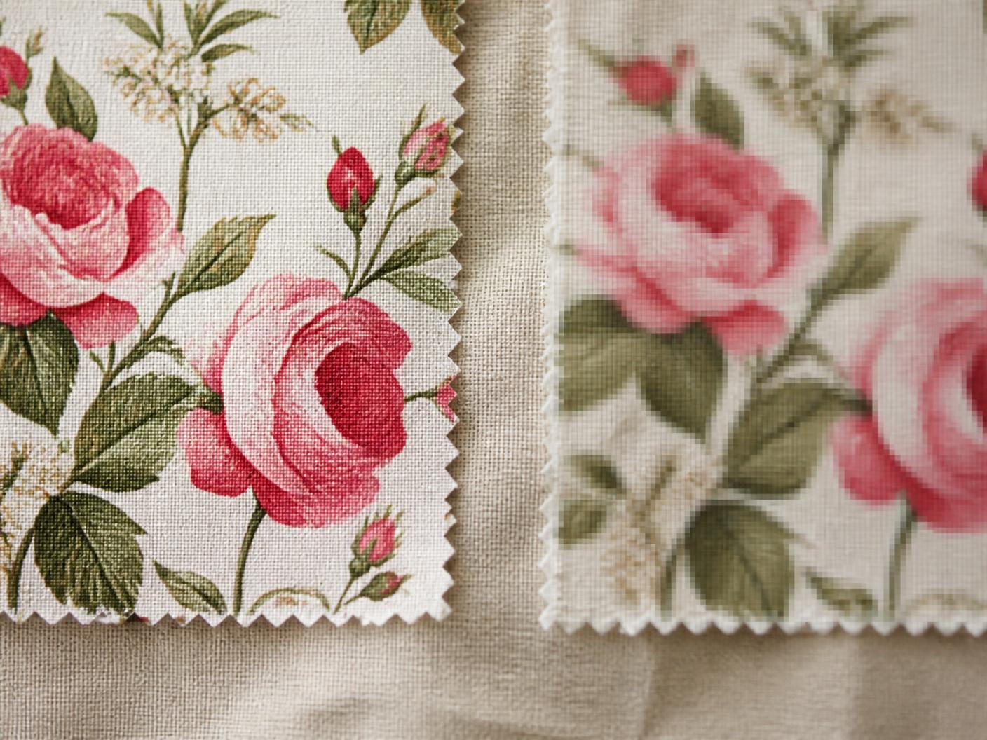
The cost of getting this wrong is real: low DPI produces blurry, muddy prints that are usually discovered after a production run, when the fabric is already paid for. All Oura patterns are supplied at 300 DPI, print-ready. See the full pattern library.
File Formats Explained
Three formats cover almost every pattern workflow:
- PSD (Photoshop) — layered and editable. Use it when you need to recolour, remove a motif, change the ground or adapt the artwork to a brand palette.
- TIFF — flattened, lossless and print-ready. This is the file most textile mills and printers ask for, because it is universal and carries no surprises.
- PNG — web-ready and supports transparency. Use it for mockups, lookbooks, e-commerce imagery and any placement over another background.
A typical workflow moves through all three: customise in PSD, export a flattened TIFF for the mill, and keep a PNG for digital presentation. Holding multiple formats means you never have to go back to the designer to make a routine change, and your production partner always receives the file they expect.
Every Oura download ships as commercial-quality PSD and TIFF seamless repeat files. See what’s included in each Oura download.
Scale and Placement
Scale describes how large the motifs sit within the repeat — how many centimetres one flower, stripe or geometric unit occupies on the finished product. The same artwork can feel like two entirely different prints at two different scales.
- Small-scale patterns — ditsies and tiny repeats. Quiet, intimate and forgiving; they read almost as texture from a distance and suit nightwear, kidswear, linings and shirting.
- Large-scale patterns — statement prints. Bold and photographic on the hanger, best on maxi dresses, kaftans, curtains, wallpaper and bed linen where the full motif has room to land.
Scale also shapes how premium a product feels: over-scaled motifs on a small garment read as loud, while a print scaled too small on a large surface can look like unintentional noise. Always test scale on the actual product before production — print a swatch at true size and pin it to the garment or panel.
Patterns can be resized, and a well-built 300 DPI file keeps its resolution comfortably when scaled down; scaling up dramatically is where detail starts to thin, so confirm the intended print width with your mill first. Browse patterns and filter by category and licence.
Color Theory in Pattern Design
Colour decides whether a pattern sells. Two brands can licence the same drawing and get completely different results purely from the colourway — it is the fastest lever you have for positioning a print as premium, playful or classic.
Work in the right space for the destination: CMYK for anything printed on fabric or paper, RGB for screens, e-commerce and social. Convert deliberately rather than letting software guess, and proof physically whenever a shade is critical.
Colour psychology is practical, not mystical. Warm tones — terracotta, coral, butter yellow — feel energetic and close. Cool tones — sage, dusty blue, slate — feel calm and considered. The 2026 palettes we see most in briefs are earthy neutrals, soft pastels and a small number of saturated accents used sparingly.
For screen printing, colour separation also decides cost: each colour is a separate screen, so a disciplined palette is cheaper and cleaner to produce. Oura’s Blush Botanica uses sage, blush and berry for exactly that reason — three well-chosen shades reading as premium. Explore collections by colour palette.
Common Pattern Design Mistakes to Avoid
- 1. Poor repeat registration. Misaligned tiles leave visible seams and broken motifs. In production the pattern simply looks sloppy. Avoid it by tiling the artwork at least 3×3 and inspecting every join before release.
- 2. Wrong DPI. Using a 72 DPI file for print gives a blurry final product and a disappointed customer. Always supply and demand 300 DPI for manufacturing.
- 3. Ignoring scale on the product. A motif that looks right on screen can be far too busy or too sparse on cloth. Print a test swatch at actual size before committing.
- 4. Inadequate colour separation. Screen printing needs clean separations, and every extra colour raises cost. Three to five colours is the practical sweet spot.
- 5. Not testing the repeat. Seams and drift often only appear once ink meets fabric. Always run a printed test repeat before a production order.
Oura patterns are tested for each of these factors, ensuring production-ready artwork arrives with no surprises at the mill.
How to Use Seamless Patterns in Your Brand
Fashion
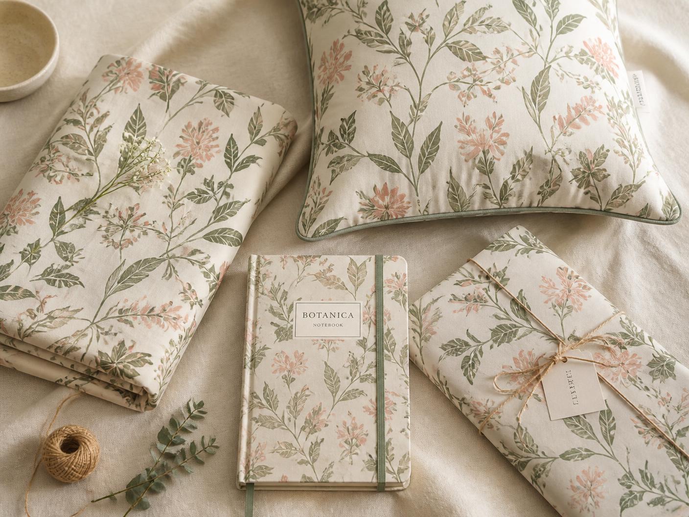
Dresses, shirts, sleepwear, scarves and co-ord sets. Choose scale by silhouette: smaller motifs on fitted pieces where the fabric curves and cuts through the repeat, larger motifs on loose, flowing garments that give the print room. Explore women’s wear patterns.
Home Décor
Bedsheets, curtains, cushion covers and wallpaper. Consider room size and mood — large blooms overwhelm a small room, while a tight repeat can disappear across a big wall. Pair a hero print with one quieter coordinate for a cohesive scheme. Shop home décor patterns.
Stationery & Packaging
Notebooks, gift wrap, boxes and labels. Pattern is the cheapest way to make packaging feel considered, and it carries brand identity across touchpoints where a logo alone would feel thin. Browse stationery patterns.
Print-on-Demand
Mugs, phone cases, tote bags and hats. Because the file is seamless, one pattern scales across a hundred product types with no redrawing — the strongest margin argument for licensing rather than commissioning per product. View print-on-demand friendly patterns.
Coordinating Multiple Patterns
Choose two or three complementary patterns sharing one palette, and vary their scale so they do not compete. The reliable formula: mix a statement print with a ditsy accent, and let a plain or textured ground rest between them.
Beyond the Basics: Next Steps
Once you understand repeats, resolution and scale, the next decision is ownership. Ready-made patterns work when you need speed, variety and a controlled budget — seasonal drops, capsule ranges, print-on-demand catalogues. A custom commission makes sense when the print has to carry a specific brand story, palette or motif that nothing off the shelf can deliver.
Licensing follows the same logic. A Standard licence gives you full commercial rights while the design remains available to other buyers — budget-friendly and ideal for volume. An Exclusive licence means one design, one buyer: the pattern is retired from sale after purchase, which is what you want for a signature print. For a full breakdown of costs, rights and which to choose, read the pattern licensing guide: standard vs exclusive.
- Browse ready-made patterns
- Read the pattern licensing guide
- Learn about Standard licences
- Learn about Exclusive licences
- Commission a custom pattern
Conclusion
A seamless pattern is a technical object as much as an artistic one: the repeat structure controls rhythm, 300 DPI and CMYK control fidelity, file formats control workflow, and scale controls how the print is read on the body or in a room. Pattern quality shows — cheap artwork looks cheap the moment it is printed at a metre wide.
Testing before production is the single habit that saves the most money: one printed swatch at true scale answers questions that no screen can. Every Oura pattern is drawn as a tested, production-ready repeat, delivered in the formats your mill actually asks for. Start your next design with Oura.
Questions
Seamless pattern design, answered.
Keep reading
Related reading.
- Floral Pattern Trends 2026: Prints You'll See Everywhere This YearSofter colour, larger blooms and hand-drawn detail — the ten floral print directions shaping fashion, home décor and lifestyle products in 2026.
- Pattern Licensing Guide: Standard vs Exclusive — Choose the Right License for Your BrandStandard or exclusive? Compare costs, rights and exclusivity, then use five questions, three brand scenarios and sample budgets to decide in five minutes.
- Commission a custom pattern for your collectionSend a brief and we'll design a repeat around your brand.
- More field notes from the studio
New pattern drops
Get new patterns before anyone else.
A quiet letter from the studio — new drops, exclusive releases and print notes. No noise, unsubscribe any time.
More field notes are in the works.
Back to journal