
Education · By Ayushi Shah · 13 August 2026 · 8 min read
How to Choose the Right Pattern for Your Brand: A Step-by-Step Guide
A five-step framework for choosing seamless patterns — brand aesthetic, product type, scale, colour palette and the trend versus timeless call.
In short
Key takeaways
- Pattern choice is a brand decision: the right print earns recognition, the wrong one wastes fabric, sampling and shelf space.
- Step 1 — define your aesthetic first: positioning, emotion and colour before any motif.
- Step 2 — choose for the product: dresses and curtains want large scale, shirts and cushions want medium, stationery wants small.
- Step 3 — always test scale by printing a swatch at actual size and pinning it to the real product.
- Step 4 — use a three-colour strategy: hero, supporting and neutral, with three to five colours maximum.
- Step 5 — mix roughly 70% timeless core patterns with 30% trend-led seasonal drops.
- Six questions settle the decision, including whether the print is a signature (exclusive) or supporting (standard) design.
- Start with three to five coordinated patterns rather than one — collections outsell single prints.
Choosing a pattern feels like a small decision until it becomes the thing customers recognise you by. A print sits on the shop floor, in the photograph, on the hanger and in the memory of the person who bought it. Get it right and the pattern does the work of marketing: people see the fabric and know whose it is.
Get it wrong and the cost is real. A print that fights your positioning confuses the customer, a scale that fails on the garment turns into unsellable stock, and a trend-only choice looks tired the season after it launched. The money is not lost in the licence — it is lost in the fabric, the sampling and the shelf space behind it.
This guide walks through the exact process the studio uses with brands: a five-step framework covering brand aesthetic, product type, scale, colour palette and the trend-versus-timeless call, followed by six decision questions, a real budget scenario, the six mistakes brands repeat most often, and how to move from decision to purchase. Read it once and you should be able to brief yourself.
Step 1: Define Your Brand Aesthetic
Before scale, colour or licence, decide what your brand is. Positioning drives everything downstream — a luxury label and an accessible high-street label can want the same botanical motif and need two completely different treatments of it. Luxury leans on restraint, negative space and refined colour. Accessible leans on friendliness, clarity and repeatable motifs. Playful leans on contrast, character and unexpected pairings.
Aesthetic is the visual language your brand speaks. It is the sum of colour, motif, density, line quality and the mood the finished product creates in a room. It is not a style label you pick once; it is the consistency a customer feels across ten products.
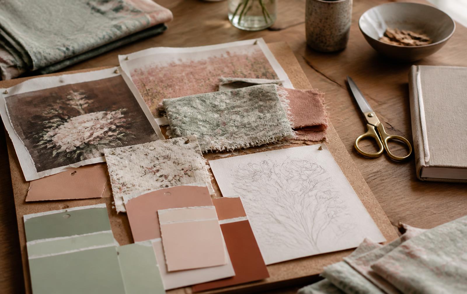
A mood board is the fastest tool for finding it. Pull printed swatches, torn pages, paint chips, photographs and packaging you respond to, put them physically side by side, and let the repeats tell you what you actually like — screens flatten colour and hide texture, paper does not.
Questions to ask
- Is your brand luxury or accessible? Price point and print restraint move together.
- Are you trendy or timeless? Decide before you fall in love with a print.
- What emotions should your patterns evoke — calm, joy, nostalgia, confidence?
- What colours already define your brand, and which of them can live in a repeat?
- Who is the customer, and what is already in her wardrobe or her home?
Exercise: build a mood board of five brands you admire. Note what they share — a colour temperature, a motif density, a level of hand-drawn imperfection. That overlap is your aesthetic, written down in someone else's work. Now find patterns that speak it in your own voice.
Step 2: Identify Your Target Product Type
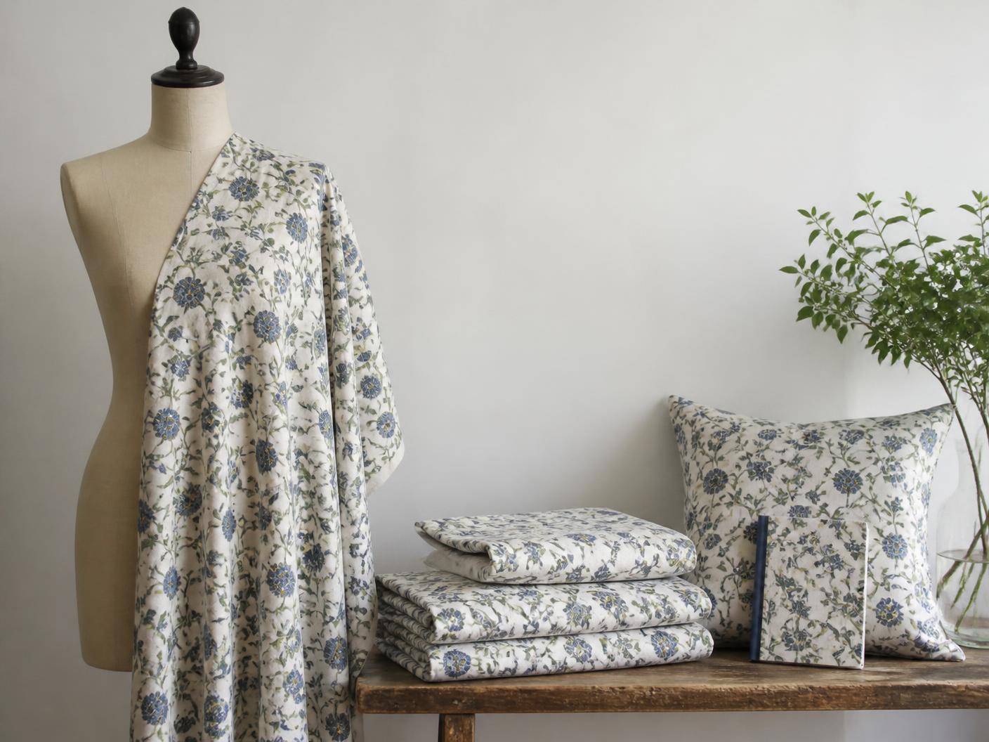
A pattern is never chosen in the abstract. It is chosen for a place to live. The same repeat behaves differently on a gathered maxi dress, a structured shirt, a curtain drop and a notebook cover, because each surface offers a different amount of uninterrupted space.
For Fashion Brands
- Dresses: large scale works best — motifs stay whole instead of being cut by seams and darts.
- Shirts: medium scale, with smaller motifs that survive structured panels and plackets.
- Scarves: almost any scale works; a scarf is one large, uninterrupted canvas.
- Sleepwear: delicate, intimate scales — soft density, gentle contrast.
- Menswear: structured geometrics or subtle, low-contrast florals.
Browse women's wear patterns and men's wear patterns to see how scale shifts between the two.
For Home Décor
- Bedsheets: large scale creates impact across a wide, flat surface.
- Curtains: very large scale — the pattern must read from across the room.
- Cushions: small to medium; cushions are intimate objects viewed close up.
- Wallpaper: large scale preferred, because it covers vast uninterrupted surfaces.
- Table linens: medium scale — functional and decorative at once, half of it covered by plates.
Shop home & table patterns designed for these surfaces.
For Stationery & Gifting
- Smaller scales work best — paper offers very limited space per surface.
- Complexity matters: a busy repeat on a small format reads as chaos, not detail.
- Coordinate two or three patterns so a notebook, wrap and card look like a family.
Browse paper & desk patterns built for small formats.
Step 3: Match Pattern Scale to Your Product
Scale is how large the motifs sit inside the repeat. It is the single most underestimated decision in pattern buying, and the one most often discovered too late — on printed fabric, after production has been paid for.
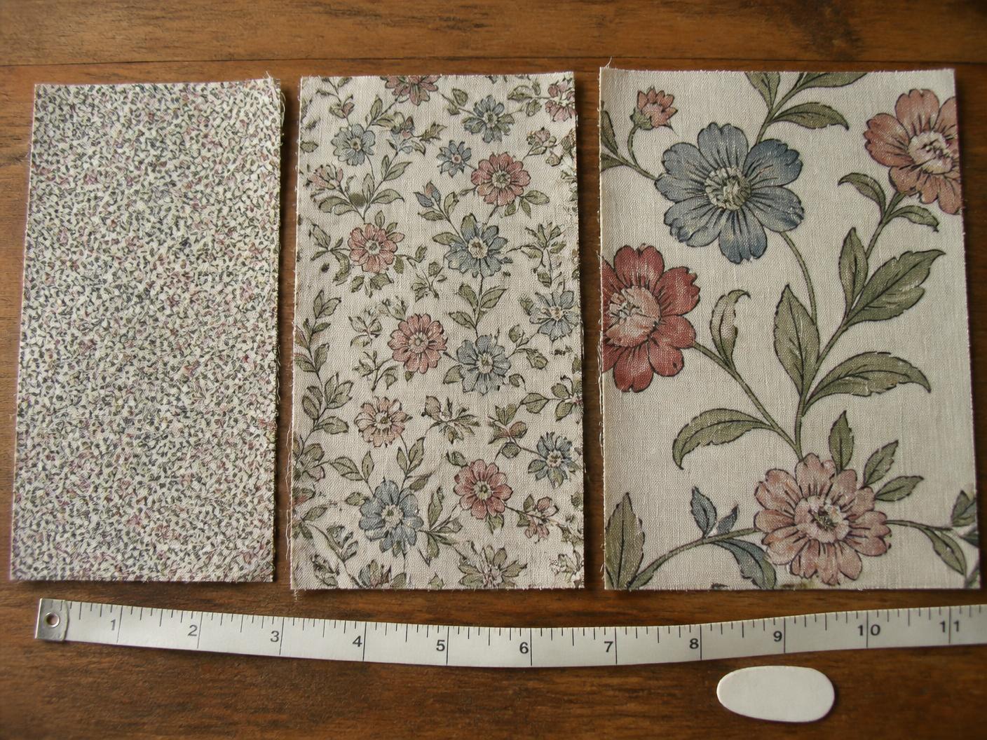
- Small scale (ditsy): intimate, texture-like, subtle. Works on fitted garments, small products and intimate spaces. Example: Whisper Bloom.
- Medium scale: versatile and balanced, the safest across a mixed range. Works on most fashion pieces and coordinated collections. Example: Retro Rhythm.
- Large scale: statement, photographic, bold. Works on maxi dresses, bed linen, wallpaper and hero pieces. Example: Blush Meadow.
How to test scale
- Print a swatch at actual size — not scaled to fit an A4 sheet.
- Pin it to the garment, cushion or panel it is meant for.
- Step back to the distance the customer will see it from.
- Ask honestly: too busy, too sparse, or right?
- Adjust the scale before committing to bulk production.
A pattern that is perfect at small scale becomes overwhelming at large scale — and the reverse is just as true.
Step 4: Select Your Colour Palette
Colour is the fastest way to position a brand. Before a customer registers the motif, she has already read the palette as premium, playful or minimal. That reading happens in under a second and it is very hard to argue with afterwards.
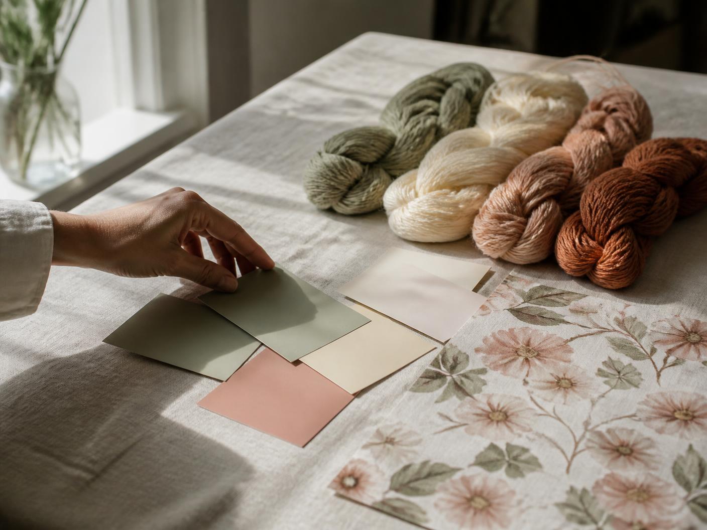
The three-colour strategy
- Hero colour: your primary brand colour, the one people remember.
- Supporting colour: complements the hero and carries the mid-tones.
- Neutral: balances the two and gives the eye somewhere to rest.
Blush Botanica is a clean example: blush as the hero, sage as the supporting tone and a deeper berry as the accent that stops the palette going soft.
Colour psychology in practice
- Warm tones — terracotta, coral — read as energetic and approachable.
- Cool tones — sage, dusty blue — read as calm, considered, premium.
- Neutrals — cream, taupe — read as timeless and endlessly versatile.
- Bold accents supply personality; use one, not four.
Trend versus timeless colour
- Trend colours for 2026: soft pastels, earthy neutrals and saturated accents.
- Timeless colours: navy, cream, terracotta and sage — they always work.
- The smart strategy: a timeless base with one trend accent per season.
Test before committing
- Request colourway samples rather than approving on screen.
- See the palette on your actual material — screen colour is not print colour.
- Trust printed samples over digital proofs, every time.
Step 5: Decide Trend vs Timeless
Every pattern you license sits somewhere on a line between current and enduring. Neither end is wrong; they simply carry different sales curves and different risks.
Trend patterns
- Current and relevant — they sell immediately, then date in two to three years.
- Example: maximalist florals are firmly trending through 2026.
- Best for seasonal collections, limited editions and fresh drops.
- Risk: unsold inventory looks old very quickly.
- Upside: strong initial sell-through and social relevance.
Timeless patterns
- Always relevant — they never feel dated, and they sell steadily rather than sharply.
- Example: geometric minimalism and neutral botanicals.
- Best for core collections, brand anchors and signature prints.
- Risk: slower initial sales, so patience is required.
- Upside: long-term sellers that build brand recognition.
The mix that works: 70% timeless, 30% trend. The timeless core keeps revenue stable across the year; the trend layer keeps the brand feeling alive and gives you a reason to post, launch and re-photograph.
For what is moving right now, read the 2026 floral pattern trends.
The Decision Framework: Questions to Ask
Ask these six questions in order. Each one closes off a set of options, so by the sixth you are choosing between two or three patterns rather than two hundred.
| Ask | What it decides |
|---|---|
| What emotion should my brand evoke? | Determines colour direction and pattern type. |
| What products will this pattern appear on? | Determines the scale you need. |
| Is this a signature print or a supporting print? | Determines the licence — exclusive or standard. |
| How long do I want to sell this pattern? | Determines trend versus timeless. |
| Does it fit an existing collection or stand alone? | Determines colourway and style coordination. |
| Am I ready to invest in this pattern? | Determines budget: ₹800 standard, ₹2,500+ exclusive. |
The decision tree, in plain text
- If your brand is premium → choose sophisticated colour and refined, restrained pattern.
- If fashion is your focus → prioritise scale and cross-silhouette versatility.
- If this is a signature print → consider an exclusive licence.
- If you want to sell it for two years or more → lean timeless.
- If it joins an existing collection → match colourway and motif weight to what you own.
- If budget is limited → start with standard licences and build up.
Question three is the one brands rush. Learn how standard and exclusive licences differ before you decide.
Real-World Scenario: Making the Decision
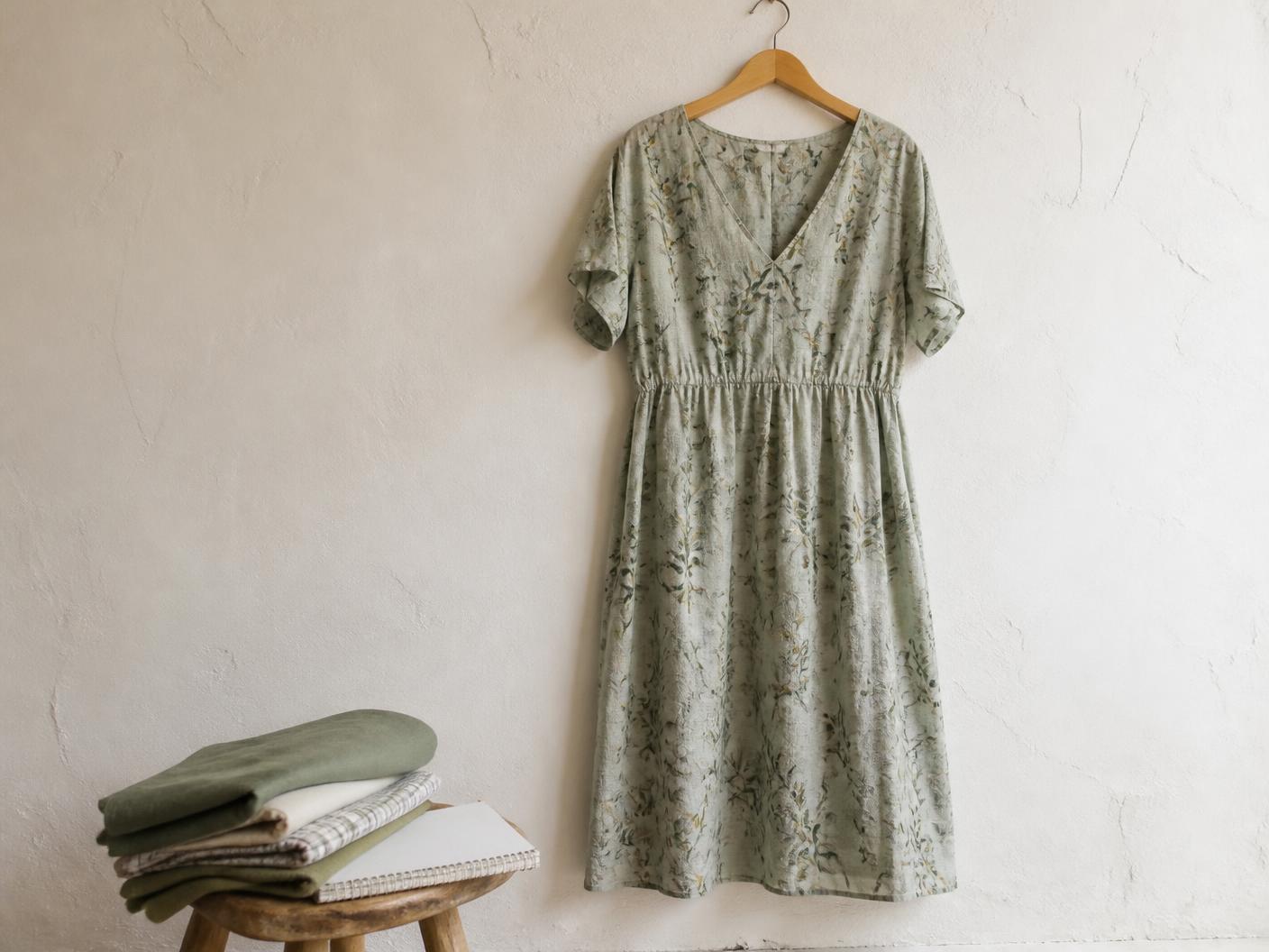
Scenario: starting a sustainable fashion brand
- Brand position: premium, eco-conscious, timeless.
- Product: organic cotton dresses, maxi and fitted styles.
- Budget: ₹10,000 for patterns.
- Timeline: a three-year plan, not a single season.
The decision, step by step
- Emotion: sophisticated, natural, calming.
- Colour: sage, cream and muted terracotta.
- Scale: mostly medium — it flatters both silhouettes — plus small scale for linings.
- Trend: timeless preference, with one or two trend-led options per year.
- Licensing: one to two exclusive hero prints plus three to four standard supporting prints.
- Budget: ₹2,500 × 2 exclusive + ₹1,000 × 3 standard = ₹8,000, leaving room to sample.
This is the hybrid approach in practice: premium positioning carried by exclusive hero prints, with standard patterns supplying flexibility, coordination and range at a fraction of the cost.
Common Mistakes When Choosing Patterns
Mistake 1: choosing trend only
The pattern dates in two years, inventory becomes unsellable, and the brand looks like it is chasing rather than leading. Better: balance trend and timeless at roughly 70/30.
Mistake 2: ignoring scale on the actual product
It looks right on screen and lands wrong on fabric — usually discovered after production. Better: always print a swatch at actual size and pin it to the garment.
Mistake 3: too many colours
Screen printing charges per colour, and a crowded palette reads as noise. Better: three to five colours maximum, three being optimal.
Mistake 4: not testing coordination
Each pattern looks beautiful alone and they clash on the rail. Better: build coordinated sets and test the combinations together before buying.
Mistake 5: copying a competitor's success
Their positioning, audience and product mix are not yours, so their bestseller is not evidence for you. Better: choose against your own brand identity.
Mistake 6: rushing the decision
A wrong pattern costs far more than the licence. Better: run this framework and give yourself a week.
Oura patterns are tested for scale, production quality and coordination — the studio handles the technical mistakes so you can focus entirely on brand fit.
Next Steps: From Decision to Purchase
You know what you need. Now find it — there are three routes, and most brands use two of them.
Option 1: browse ready-made standard patterns
- Instant purchase and immediate download.
- Lower budget: ₹800–₹1,500 per pattern.
- Ideal when you need variety and coordination quickly.
Option 2: acquire an exclusive design
- One-time investment, permanent single-buyer ownership.
- Higher budget: ₹2,000–₹5,000+.
- Ideal for signature and hero prints that define the brand.
Option 3: commission a custom pattern
- Designed specifically around your brief, palette and category.
- Collaborative process with the studio.
- Highest investment, and the only route to a completely unique vision.
Start a custom project with a short brief on category, palette and end use.
How to browse efficiently
- Filter by product category — fashion, home, stationery.
- Filter by aesthetic — botanical, geometric, minimal.
- Filter by colour palette to hold your three-colour strategy.
- Filter by licence type: standard versus exclusive.
- Save favourites so you can compare shortlists side by side.
Pro tip: start with three to five patterns rather than one. Coordinated collections sell better than single prints, because they let a customer buy twice.
Conclusion
Choosing a pattern is an investment in brand identity, not a line item in a sampling budget. This framework removes the guesswork: define the aesthetic, name the product, match the scale, set the palette, then decide how long you want to sell it.
The right pattern earns recognition, repeat customers and steady sales. Every Oura design is drawn as a true seamless repeat and supplied production-ready, so there are no surprises at the mill — and with standard, exclusive and custom routes there is a path at every budget.
Questions
Seamless pattern design, answered.
Keep reading
Related reading.
- Surface Pattern Design 101: Seamless Repeats ExplainedHow seamless patterns actually work — repeat types, 300 DPI, file formats, scale, colour and the five mistakes that cost brands money.
- Floral Pattern Trends 2026: Prints You'll See Everywhere This YearSofter colour, larger blooms and hand-drawn detail — the ten floral print directions shaping fashion, home décor and lifestyle products in 2026.
- Commission a custom pattern for your collectionSend a brief and we'll design a repeat around your brand.
- More field notes from the studio
New pattern drops
Get new patterns before anyone else.
A quiet letter from the studio — new drops, exclusive releases and print notes. No noise, unsubscribe any time.
More field notes are in the works.
Back to journal